Triple wp logo
Brief from client
Triple wp is an application that simplifies the user experience of developing a website within Wordpress. I really want to get a visual identity that is friendly, not intimidating and incorporates a typeface that reflects our cutting-edge tech.In addition, a majority of the application has already been designed around a blue, white, and black color scheme that the logo should also use.
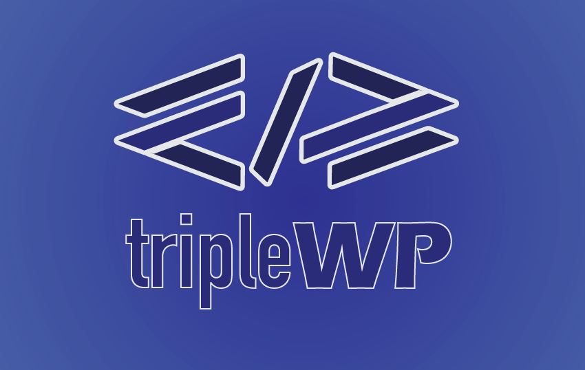
I used code brackets to create a dynamic feel to the mark this helps illustrates the company's desire to make web design easier; on the mark I used the letter "w" rotated at 90 degrees to create the brackets and the slash in the middle to help better define the hidden letter "p", thus creating the abbreviation wp. I also went with a bold Sans serif typeface to create a friendly feel and a thin typeface for a more technical feel.
2 Comments
I think it is a real stretch to say there is a W and a P created by the coding symbols. If you are trying to make website development less intimidating, using coding symbols is probably the most intimidating thing you can do.
Thanks for the feedback I felt the same way during the process, I should have used another method