Brands of the World is the largest free library of downloadable vector logos, and a logo critique community. Search and download vector logos in AI, EPS, PDF, SVG, and CDR formats. If you have a logo that is not yet present in the library, we urge you to upload it. Thank you for your participation.
Version history
Version 1

- I
- S
- T
- C


3 Comments
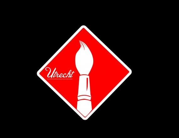
Colours far too bright and looks like a warning symbol.
Could use some better typography, maybe a the name and then the icon next to it, instead of being squeezed in so tiny.
^^ Second Everything.
The name would look better if it wasn't crushed in the corner, and it does very much symbolize some sore of warning label.
Use a cool color scheme.
The name has to be comparatively bigger enough to read at the smallest possible size of the icon.
Its not readable in the thumbnail view.
also try something losing the tilted square, the basic shape in the background.