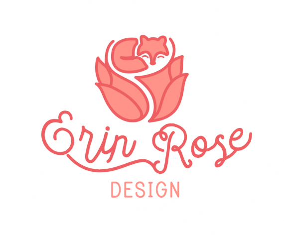
Erin Rose
ErinsSonicYouth | Mon, 04/09/2018 - 05:22
Brief from client
Hey guys,
So I know this logo still needs a ton of work. I've just been staring at it for hours and I don't think I'm seeing it with a critique's eye anymore.
I'm personally rebranding myself: we all know that's one of the hardest things to do.
My name is changing to Erin Rose fairly soon, and I've personally outgrown my current branding.
So I'd like critiques on my progress. The concept is taking the fox from my old branding, and mixing it with a rose to represent my new name and change as a person.


13 Comments
Here is the old branding, for comparison.
Version with a solid fox
I think you have too much going on with the frilly font. I like your fox and flower thing, but I think the name and the design compete for attention.
Well, I am torn on the fox- he fits into the rose so well with the matching lines, but is a better illustration as a solid (you lose the break between face/body and makes the nose look different too.)
As for the type- I agree with above. I assume this was hand lettered (which is awesome!) but maybe it just needs simplified a bit so they don't compete. Maybe remove the line between Erin and Rose as it's not really necessary. And maybe some of the curls in the R and see how that looks.
Very cute!
Assume all you want ;)
I agree on the fox, I'm trying to find a way to make a happy medium between the two fox styles.
I'll simplify that type and see how it looks. I've been staring at it so long, I was afraid it didn't look like a rose whatsoever.
sooooo did you hand letter??? =)
I plead the 5th.
Its edited, that's all that matters lol
Nickainley??? lol
No actually, it isn't. Its a pretty hard to find font, I'm keeping my secrets lol
I really like this logo. I really like that it looks very organic. The wonky custom hand made type is really cool.
The one thing I would remove the subtext "design" as it sorta clashed with the rest of the logo. It's the only element you haven't designed yourself and it kinda feels like a sore thumb. Also, your logo will more than probably always be shown "in context", either on a business card or a website, where it would be pretty obvious that you are a designer. So it's no really needed.
Good job Erin!
Which fox do you prefer btw?
Nice! looks better than the old on, for me that is.
I prefer the solid fox too. Have you tried a solid rose too?
I also agree with Shawali said regarding the (Design) subtext, I have to agree with what he says, personally I learned a lot from his notes of different logos here on BOT.