GabsPacks
MiguelSRodrigues | Sat, 12/16/2017 - 19:00
Brief from client
Cigarette pack collector
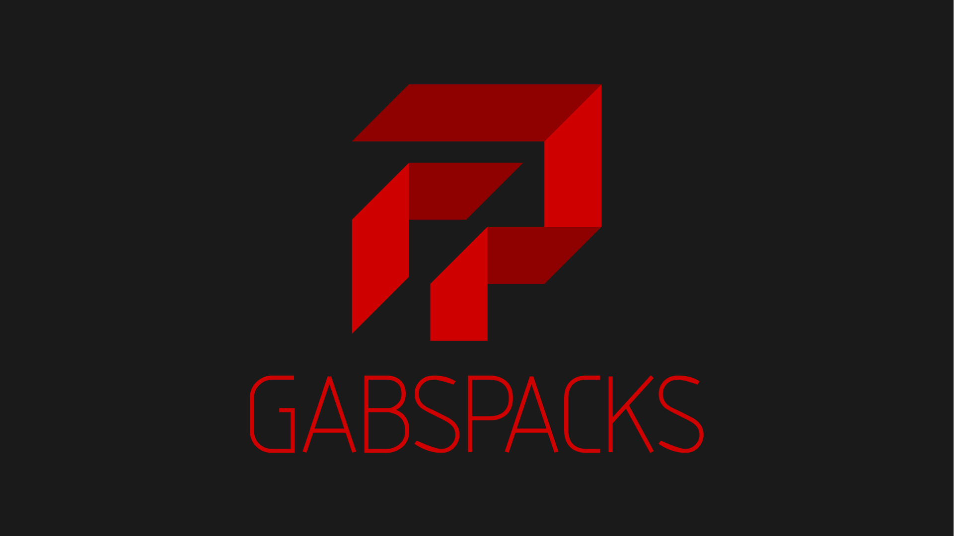
I'm designing a logo for an instagram page of a cigarette pack collector. The concept of the logo is a reversed "G" with a "P" on negative space, and i tried to create this kind of pack/box shape. Once that i'm a rookie at logo design i would like to have some opinion before I present the logo to the client.
1 Comments
I'm seeing the "P", but not the "G", unfortunately. Even when I'm told there is a reverse G, it's hard to make out.
I like what you have with the folded ribbon look, and the P is fine. You could probably have another ribbon in the G shape next to it making an overall pack/box shape.
Do you have an idea of what the logo would look like in one color? You'd lose the look you have here by having solid shapes. Maybe alternating between solids and strokes?