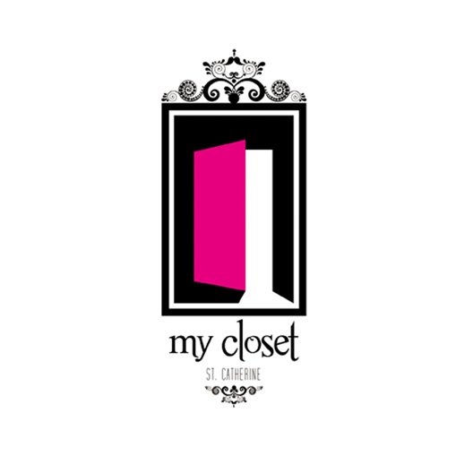
My closet
brainworks | Wed, 02/08/2012 - 07:15
Brief from client
the client wanted an icon for a shop that sells clothes for women.

The first icon - MY CLOSET was not working at all so I just had to back on the drawing board and this is what i came up with. I droped the green - so i used hot pink and black - so i used the door - because of the closet door - but what am not sure of is the floral designs - guys do they work on the logo? - Guys tell me what you think.


4 Comments
The color of the door is misleading. It makes it look like the clients of the shop are women only. If olive green is still in the list of the requirements don't drop it for no reason. The worst thing a client can ask you is "where is what I asked you to do?"
Remove those noisy flourishes and scale the text up, both lines.
Hey it is only for women - she told me but am going to remove the floral designs
OK. Fix the brief because it says "for women, children and men"
the idea looks good....need some more work tho...