PET Adminsitração
Brief from client
This is my purpose for a new logo to "Programa de Educação Tutorial em Administração" (PET ADM or PET Administração)
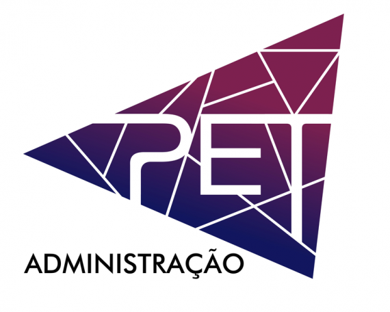
The principles of this Program that I tried to catch are Research, Education and Extension, that's why the format is basically a piramid, then I tried to create a mosaic which the word "PET" can be part of it.
Please DO NOT copy the ideas and purposes of this work, any doubts, please contact or comment.

Following the tips of "Alpreacher", I tried to keep the ideas on, reformulated the "P", making it bolder, in my perspective of course, as well as the lines i made thiner (1/4 of the letters width exactly). I also tried to make the "P" closer to the others, as different from the first concept.
I was asked about the B&W look when printed. Well, I can say the gradient will be gone, the triangle will be basically gray.
Please comment or give any suggestions, they'll be very welcome.
Thanks


4 Comments
I am a bit distracted by the mosaic lines, it is a bit busy. I think it would be stronger to just have the gradient in the triangle. You could also simplify and have less mosaic lines. Or, you could try using the gradient to divide the sections rather than white lines. I did a rough idea for you. I really like the PET and the way it cuts the triangle up, I just think it gets lost.
Thank you cooperads, but, based in your suggestions, how can i apply the ideas of this paragraph, without using the white lines?
''The ideia is to match the three guidelines and activities of the program, associtating it in an concept of network (white lines) and different forms (plurality of the members). There's only one "perfect" triangle, that represents the frontline, the tutor of this program, who can direct the members, and also, is a part of the big triangle.''
Thanks a lot!
I don't mind the colors but the symbol and typography doesn't work for me. It just doesn't look professional. If you want to stick with the idea, I would spearate the words from the symbol and have the triangle separate from the "PET" and "Administraco" and use a different typeface for that.
That's the point Kayla, I'm far from being professional haha, but I understood what you meant, I also would need some examples, mainly from the part when you said the triangle could be separated from the word, so for me that's the point. How can I combine the triangle, with mostly a big word like "Administração" and even more PET written in big letters? Mostly, how can I apply these suggestions in the perspective I presented in the first model posted?
Thanks for your attenttion