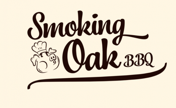
Smoking Oak
ErinsSonicYouth | Thu, 03/08/2018 - 20:00
Brief from client
A BBQ foodtruck in the Southeast.
The guy's old branding had this very dated Italian pig on it, plus a different name, so we are are revamping his business and giving him a look that better fits the local food scene.
I'm also attaching a photo of the old pig.


5 Comments
I still like and dislike the same things than in version 1.
I like: the general direction, the font.
I dislike: the pig head. Out of scale with the thickness of the word mark, all contrived in that little corner you stuck it in. Also, I'm not sure about "BBQ" in the same font as the word mark, which is not really made for initials.
Keep it up Erin!
You could make the pig a stand alone sign above the text. The logo makes me hungry so it is working for me somehow. I agree with Shawali about the placement of the pig and the BBQ comment.
Looking forward to an "improved" version
This is nice looking. I enjoy the flow of the text, yet I miss the "worn" look of version one.
I will have to semi agree with the OP above that the stroke weight of the pig is very slight in comparison to text.
Yet, that is an easy fix with multiple directions, one being slight enlargement then upping PT. size of stroke. You get the idea. I don't see the placement as a problem, yet, maybe toy with angle of pig to flow into your type,
In any case, have you thought of maybe "dirtying" or "distressing" the background a bit? Not for the vehicle wrap though.
The card you showed in version one looked great.
Not putting thumbs down for the symbol "pig" b/c it is a huge improvement from what they had and works, just needs a little fine tuning.
I would order ;) brisket!
They pitched an absolute fit about how the distressed logo looked on the vehicle wrap, so the new logo doesn't have distressing in it. Personally, I liked the distressing, but its neither here nor there now.
Damn. I can understand the not wanting distressed on the vehicle wrap b/c some may think it is actually chipped paint or some kind of problem with the logo. (who don't know what "wrapping" is)
Yet, all is not lost! Maybe as time goes by and they need other items like those little cards, you could re-introduce it in some sort of fashion.