S&R - Smail & Richards Electrical Services
Brief from client
Whole new rebrand for a long established electrical company based in Jersey C.I.
the company is more referred to as S&R so this must be prominent.
large amount of work they do is commercially based.
They have used blue on there branding before and want to keep that, but are open to ideas on any other colours that might work with blue.
Ultimately they need a new fresh logo that will be used on vehicles and stationery.

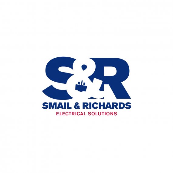
Right guys, after much to'in n fro'in the client has happily agreed this logo!
I thought i would post it to see what you think of the changes, i personally still like it, the plug had to be made into a 3 prong plug as thats what we use here in the UK and he also wanted it to look more like one of our plugs which i think it does.
We agreed that taking the swigly lines either side of the sub text off was a good idea and even changed the wording of the sub text. He requested that it went in red as this was the colour they used before.


7 Comments
I think its a way better revision! And thank goodness that you decided not to keep the side glyphs! It looks much more versatile as a logo now! I would say something about the color of the subtext, but its irrelevant since the client is happy with it. So its a win win either way good job!
BEAUTIFUL!
I still liked the lil electrical shocks but i agree more versatile =)
I think that I am in the street and I see this logo I don't understand wath is in the middle. Really, what is that element?
if you read the description you will find out!!
Take out that little plug-top in the &. It is confusing - rather fill the &-character in the same blue.
its not confusing for someone living in jersey as this is what our plugs look like, I think there would be nothing to the logo if the amphis & was just a normal amphis &
I prefer it without the connector glyph, but, i've read that client accepted, so, congratulations.
The logo in general is good for me, it reflects a lot of strength, reliability and tradition.