Teyd
Brief from client
Teyd: Tecnologia para la Evolucion y Desarrollo.
An App-Solution maker.
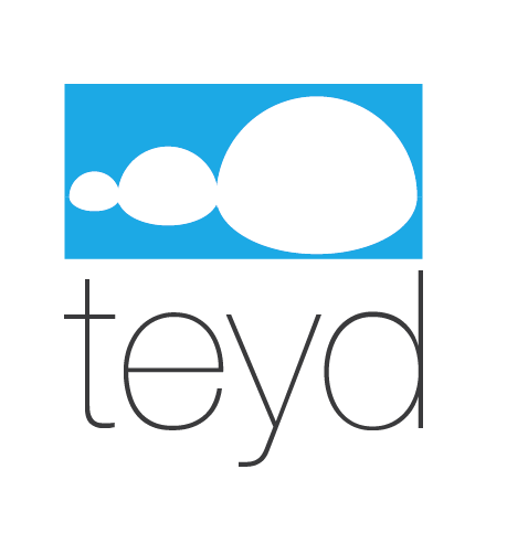
Teyd is a newborn project. Im going to enter to colleague and I want to make my own business during all my career, Teyd means: " Tecnología para la Evolución y el Desarrollo. I didn't. want TED, because is already taken. Teyd will be a technologic company, it will give solutions to problems, make apps, entertainment and such other different things. I wanted that the Logo was as simple as possible without being cold and boring. Also y wanted that the logo symbolizes evolution in a very discreet way.

Teyd is a newborn project. Im going to enter to colleague and I want to make my own business during all my career, Teyd means: " Tecnología para la Evolución y el Desarrollo. I didn't. want TED, because is already taken. Teyd will be a technologic company, it will give solutions to problems, make apps, entertainment and such other different things. I wanted that the Logo was as simple as possible without being cold and boring. Also y wanted that the logo symbolizes evolution in a very discreet way.


12 Comments
The symbol is too simple and too generic. Is it supposed to be a cloud, a mere progression sequence, a dialogue box, a fallen snowman or what? This symbol doesn't convey any of the business mission listed in the brief. They type is okay, but a little on the boring side.
This font is right for you?
Man, call me crazy but I like this.
The symbol IS totally simple and generic, per 2423's comment- but I dunno.... I like it. I could see it on the tag of a shirt more than an app solution maker (whatever that is) - but I dig it. (I could REALLY see this centered in the middle of a white t-shirt for some reason.)
Anyway, I guess I don't see 'evolution' in the symbol at all, but I DO like it, simple or not. (And now I keep seeing a snowman that's fallen over, but whatever, it works for me!) :D
im with Sara on this one, i like the symbol aswell! and i do think it shows evolution - slightly. one thing im not sure about is the blue box, im not sure you need it. It might look better with the shapes in blue and no box around them. I do like the text but i think it could be more exciting
Like this?
yep but instead of the blue put some sort of design/pattern evovling through them
type is too thin. try shrinking that down to a business card and printing it. i keep seeing a white turd in a square toilet, and the name under is the same length as turd with the same first and last letter haha.
Haha- oh my GOD, why do you keep telling everyone they suck!?! (I guess my comment at the top of this post really shoots your little "you hate everything" remark right in the foot, dudn'it!?!) :)
Im going to ignore this comment... However, where can I talk with someone who delete this comment?
Though vulgar and border line rude, illsupreme's critique is still valid. Unfortunately, you don't get to pick who comments and who doesn't.
He has a point about the font being to thin. I don't agree with him on the rest.
haha i didnt know the word turd was offensive.. what are we 3 years old people? And if i see a turd, you can bet your dollar i'm not the only person. Version 2 is solid though.
skinny font has to go, i like the font but it has no place here. Cloud looks too simple and without message for me, also i don't like how is drawn. I would integrate the type in the cloud and make some more fluid and rich in detail one.