Quality Pet Products
Roeltje | Sat, 04/12/2014 - 17:29
Brief from client
We want a logo with a subtle vintage feel to it that pays homage to the nature and the animals.

New version with adjusted typo and a flipped symbol.
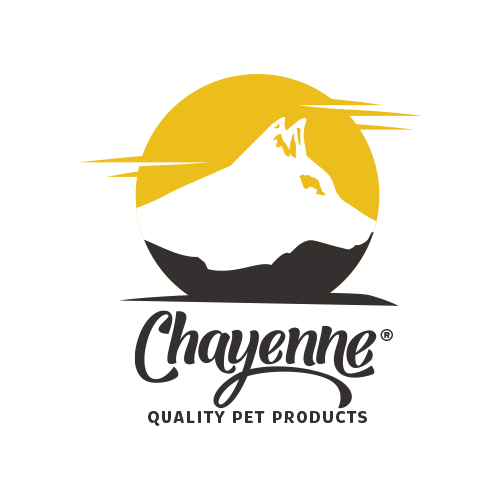
My goal is to make the white-space first of all look like a mountain, but with a dog hidden in the same silhouette. I don't want to feel like it is a dog silhouette inside a circle.
Quick question, what do you guys (or girls) see first, the mountain or the dog?


14 Comments
Label mockup.
I think we got a winner here.
Be careful though, I can see yellow strokes on the edge of the circle.
Great job.
Thanks, I really appreciate your tips!
I know, this was the work-version of the logo. The yellow lines will be deleted. ;)
Quick question, what do you guys (or girls) see first, the mountain or the dog?
The dog. But I still see the mountain also.
I honestly preferred version 2. I don't think it really looks like a mountain anymore. Wasn't the idea to have the symbol a mountain that looks like a dog, not a dog that looks like a mountain? If that makes sense.
I think you can put some (or all?) of the mountain details back in. I think it'll reduce just fine. As for embroidery, no, it probably wouldn't embroider at a small scale. But there are alternatives, such as digital printing or sublimation to replace that.
This looks really good! didnt even see the dog until you pointed it out! very solid looking logo! looks great on that label as well
Awesome logo!
But i have seen dog first. then mountain ((((
I like it! Grate:). the only thing that disturbs me is the tail of the second N would try to do it as final of G. By the way at first glance I saw the mountain, a second before the dog :)
Thank you guys, I really appreciate it!
Awesome use of negative space there. I like the minimal approach of this version, but maybe you went a little too far, the black side doesn't look as much as the nature-hills-trees from the first version. Also, you might want to work a little bit on the eye of the wolf. It looks like he's looking down to something. And definitely keep the yellow lines, it looks like a sunset in the background
I'm still seeing the dog before I see the mountain. If you somehow incorporated a second peak in the distance to the left of the ears using the dogs coat as a dividing line & maybe took the curve to the right off of the dogs ears then you could balance out the appearance of the dog over the mountain.
hi there,
are you interested in creating something similar for our school?
thanks!