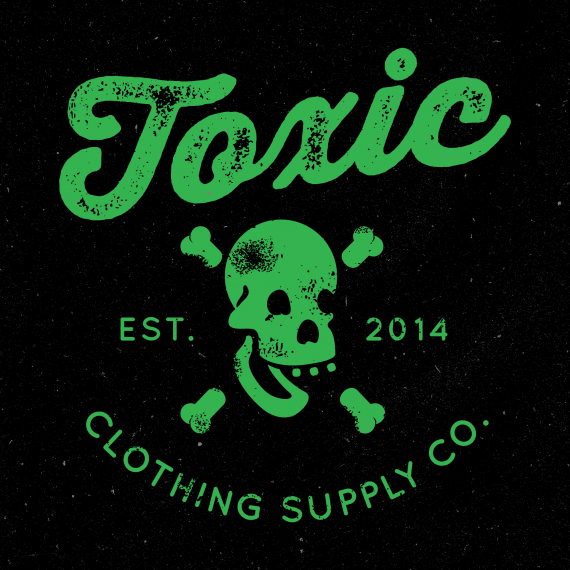
Toxic Supply Co.
BrendanLloydDesign | Fri, 06/27/2014 - 22:51
Brief from client
Clean, but a little bit of either grunge or fun mixed in.

Texture added to unify the elements in the composition. Took a typeface from V2 to add it to this version. I still agree with a comment about using the first version as the main logo, and this as a tag or separate shirt. The badge will be displayed many different ways since it's a clothing brand. Also, the skull jaw was downsized.


8 Comments
DONE! Love it! :D
it needed that grunge on the skull!
I LIKE IT
I'm so glad to hear that! :) Thanks for your help
Great job! Really liking this!!
Thanks! :)
Loved seeing the samples of this. This is definitely the strongest version. Nice job.
Thanks to everyone ! Really proud of the result. Appreciate the comments greatly.
We have a winner. :)
Command + S, Command + W, pour celebratory shot.