Vevid
Brief from client
Vevid is the name of the videography company that I would like start up one day.

So...I've decided that the name Vevid has grown on me better than EyeCatch. Even though I agree that Vevid doesn't make too much sense as a name for video production company (maybe I'll come up with something better eventually), I just like the way it sounds and it's kind of fun to say.
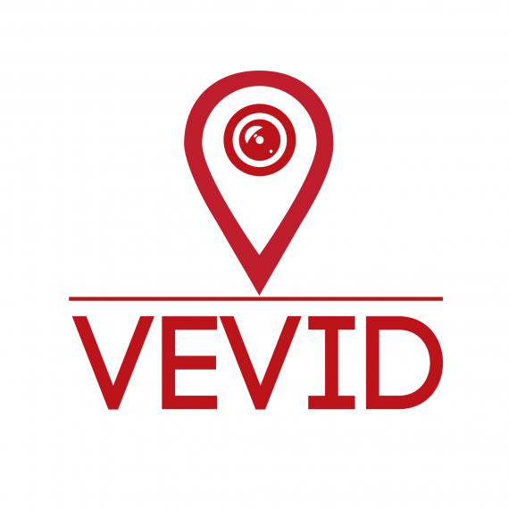
With this said, I came up to a designer and I showed her all the work I had done (including some I never posted on BOTW) and she liked two particular elements from two different designs. She seemed to like the font for Vevid and the symbol you see in this logo, and she told me to try combining the two.
Right now, I know it doesn't look too spectacular so any advice is highly appreciated.


4 Comments
Is an improvement!!! much, much better than the previous ones ..it reminds me of the marks that point destinations on google maps, so maybe you should keep playing with the symbol and exploring posibilities.
Yea It is definitely better than the others. What if you tried to make the symbol the V itself, something like this...
Much better than previous versions. I like the point of MDCasino tho...
I like the way you handle the symbol, but the font is absolutely boring and doesn't play at all with the symbol.